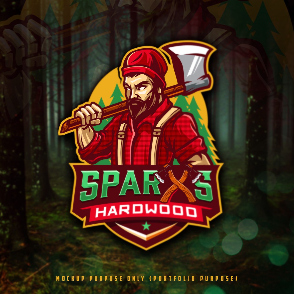
Client opening a nightclub in NC. They hate to call it a gay bar since the crowd is really anyone, but anyway lack of a better term it will serve the gay community. The bar is themed around the fictitious idea that the building was once an abandoned saw mill that turned into 2 bars. Sparx's and Mr. Hardwood's the two bars where mortal enemies until through unique circumstances they realized they had more in common than they knew. So instead of building walls to separate them, they destroyed the physical wall that separated the two bars and become 1 big happy family. The other thing client wanted the X in Sparx's to be unique, sort a logo in a logo. Its much cheaper to use just a unique X on merchandise and signs than the entire logo. So they was thinking the Sparx's X with something done to it so that it stands out on its on. Like a logo within a logo. Just want the X to be different than the rest of the font and be able to be instantly recognizable on its on.
