
99designs by Vistaで作成された
The letters used for the word "ROAD" are custom made, inspired by the traditional brewing techniques and illustrations of the beers in the website and Instagram pages. This combination of the custom made letter and the sans-serif typography in logo are a symbol of the classic and continuous (modern) paths we will encounter by evolving "down the road".
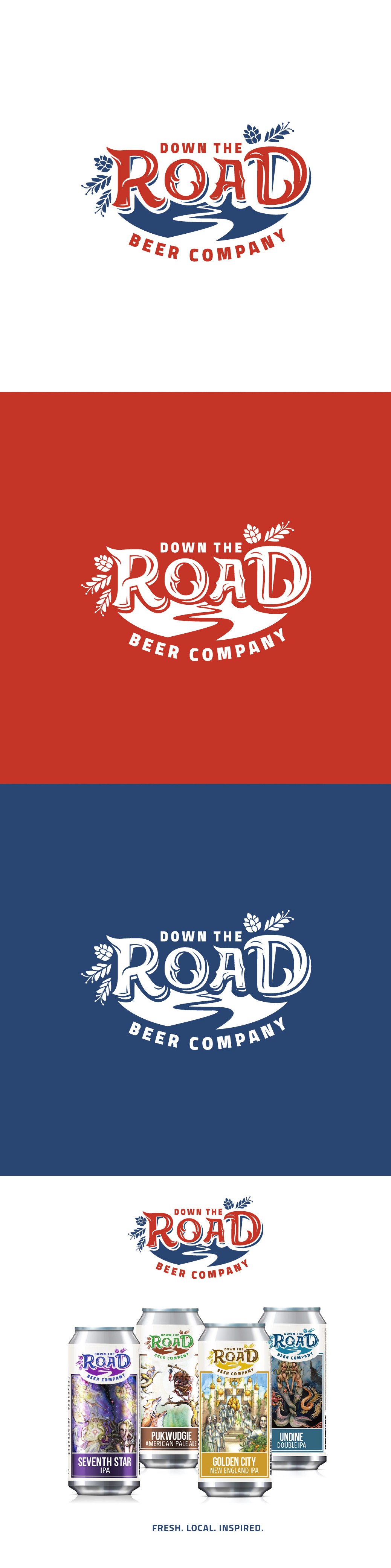
For this one I think it's interesting how the logo and the beer art look unified instead of just stamping the logo in the can. Here both designs (the art for the beer and logo) interact and join pretty well.