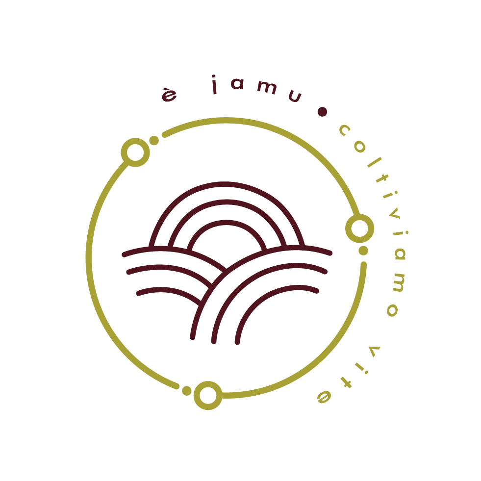

This logo has a minimalist and young concept. On this logo I represented the idea of a farm. Since you farm olive-trees, vegetables, you also do the production of wine and oil, I started thinking what all of those things have in common. Everything comes from what you farm so, I thought to go to an abstract way and represent the soil and the sun in a more geometric style, which fits one of your criteria. Because the style is so simple and minimalist, it gives an elegance look to it. It's important to refer that I also thought, by representing the idea of a farm like this it would give the notion of youth.
I also represented the idea of youth by choosing a font that is more round.
For the colors, I went for a deep red and an olive tone. The reason why was because you referred that you what to focus on wine and oil production. The deep red represents the wine and the olive tone represents the oil.