
99designs by Vistaで作成された
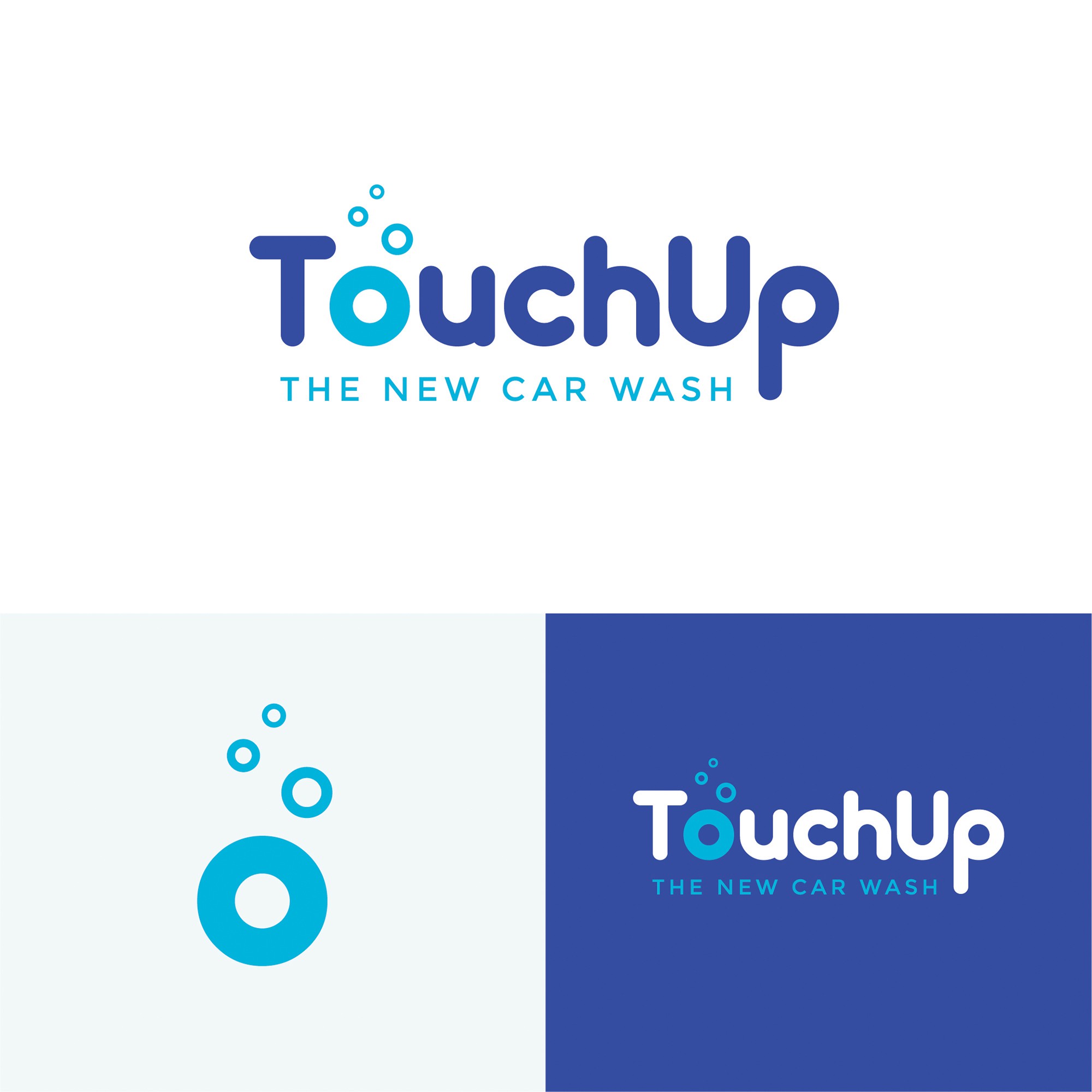
I have designed the TouchUp logo with the idea of 'quality meets playfulness'. This is represented through the use of the 'bubbly' 'TouchUp' font, combined with the simple, trustworthy font of 'The New Car Wash'.
The icon (o + bubbles) is minimal, yet fun and able to be used across social platforms, thumbnails or where the full logo may not fit, as well as an element for any branding material, patterns etc.
I have displayed 2 colourways - dark blue and light blue and its reverse (the logo can easily be placed on a dark background).