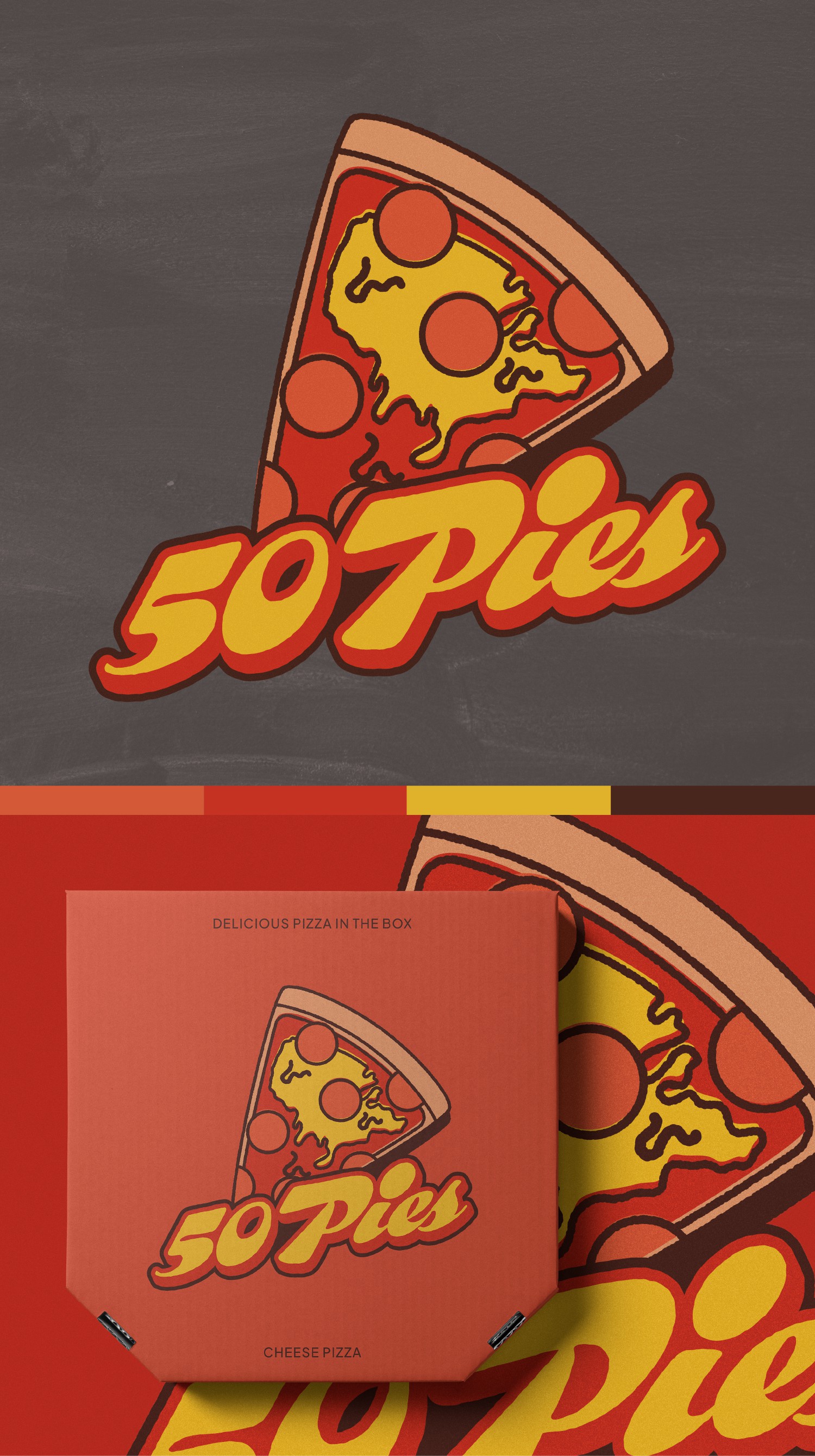

The logo is designed in an old-school retro style, featuring a slice of pepperoni pizza with melted cheese shaped like the geographical shape of the USA. This design emphasizes the brand's American roots and its classic, playful, and economical branding tone.I chose a pepperoni pizza for the logo as it is a well-known and economical product, and it fits perfectly with the overall vision of 50 Pies. The color palette consists of old-school colors such as red, orange, yellow, and brown, which associate the brand with its classic, playful, and economical tone.For the typography, I used a display font called "Whomp" to give the logo a bold and playful tone. To make the design unique, we added a 3D look to the text and sheared it vertically, giving it an old-school and fun tone.