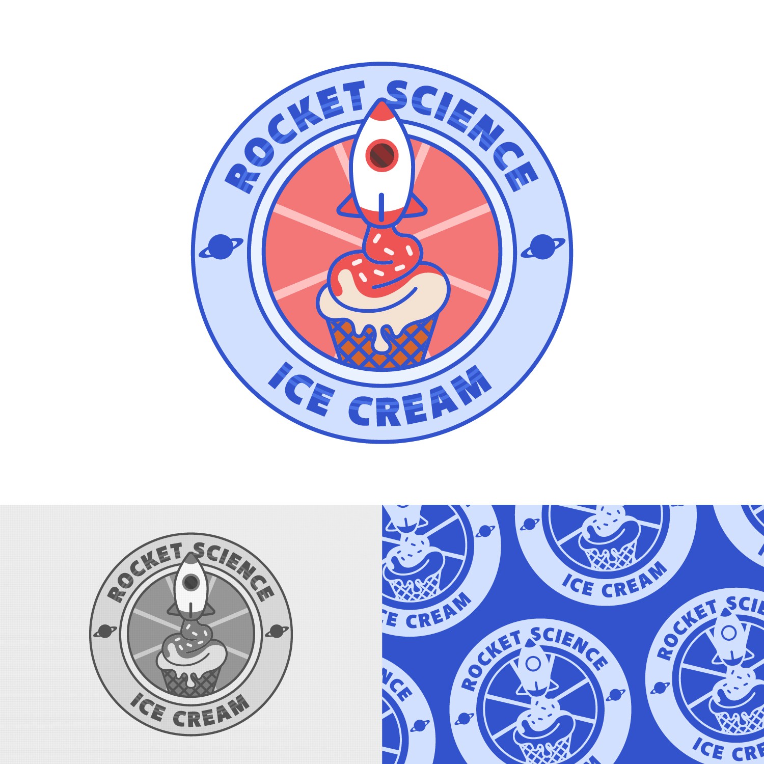

To capture the essence of Rocket Science, I designed a mascot logo featuring a rocket spouting ice cream. This not only represents the brand's focus on ice cream but also adds an element of whimsy and fun. To further enhance the space theme, I added planet icons in the outer circle of the logo. This helps create a feeling of vastness and adventure, which aligns perfectly with the Rocket Science brand.
The logo's color scheme uses vibrant blue and red as the primary colors. These colors not only create a youthful and happy vibe but also make the design minimalist and easy on the eyes.
For the typography, I chose to use the sans-serif font called "Akagi Sans Pro". This font adds a friendly bold and modern tone to the logo, which complements the playful and youthful elements of the design.