
99designs by Vistaで作成された
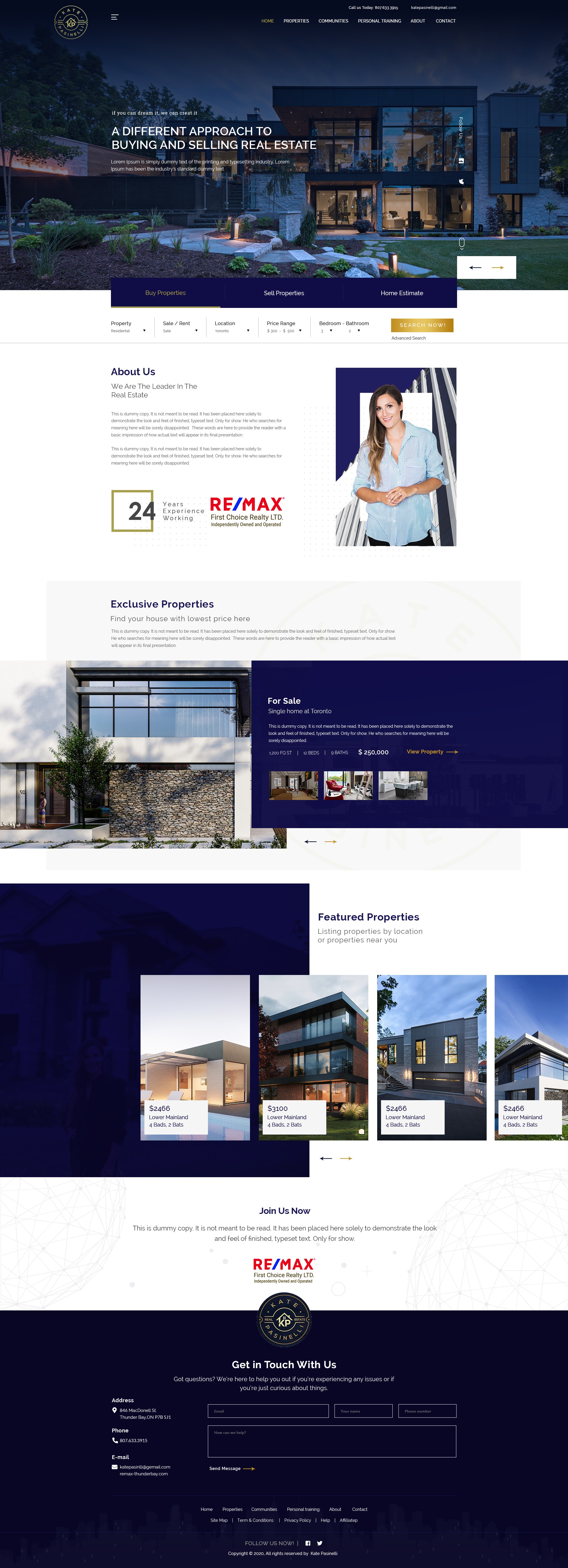
My design always speaks about clarity and focused towards the content along with elegance in design. Here I kept a bold look while using flat navy blue color tone in the layout. The use of pictures are blended with the layout and not looking overly placed. I have used sans serif font family so that it gives a feel of trust to the visitors. The placement of Re/max logo in the page tells the importance of it being here. Properties sections are divided into Exclusive and Featured which are very trendy. Contact section is center aligned in the last to gather more leads from the website. I hope you like my efforts in designing this layout for you. Please feel free to to ask for this design file and any modification you want in it.
Thanks