
99designs by Vistaで作成された
THE DONUT DILEMMA:
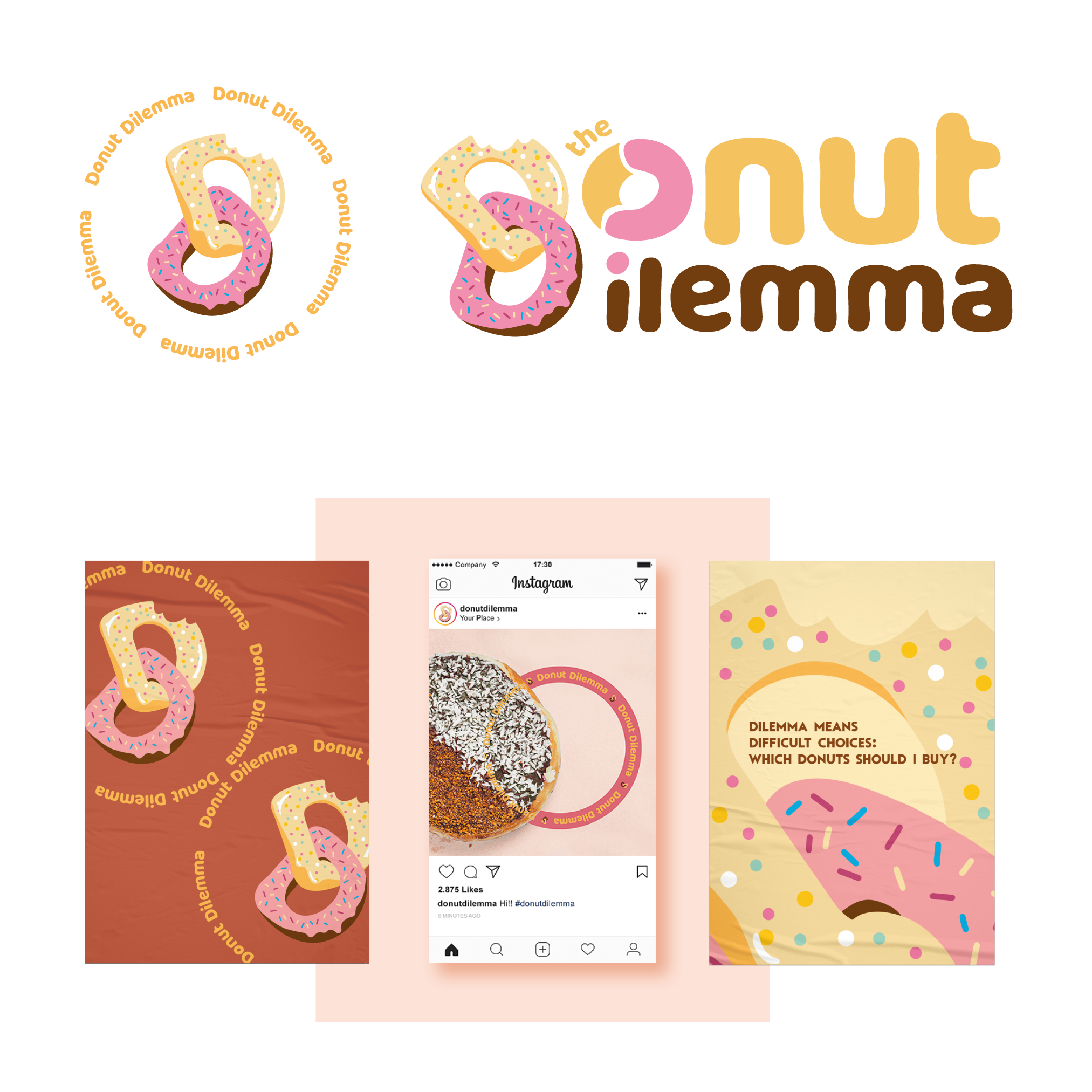
The aim of the design is to create a logo and a sub mark in order to use them separately, this will allow the application of the logo on different elements like merchandising or boxes, cups...
The logo has as main element the two Ds, this is a very characteristic point from the name as both words begin with the same letter. The dilemma is expressed by both of them, which are two different donuts chained together, cause its so hard to choose that you cant decide (so you'll probably end up doubting which one to choose or getting more than one).
I developed some concept posters using the elements from the logo.