
99designs by Vistaで作成された
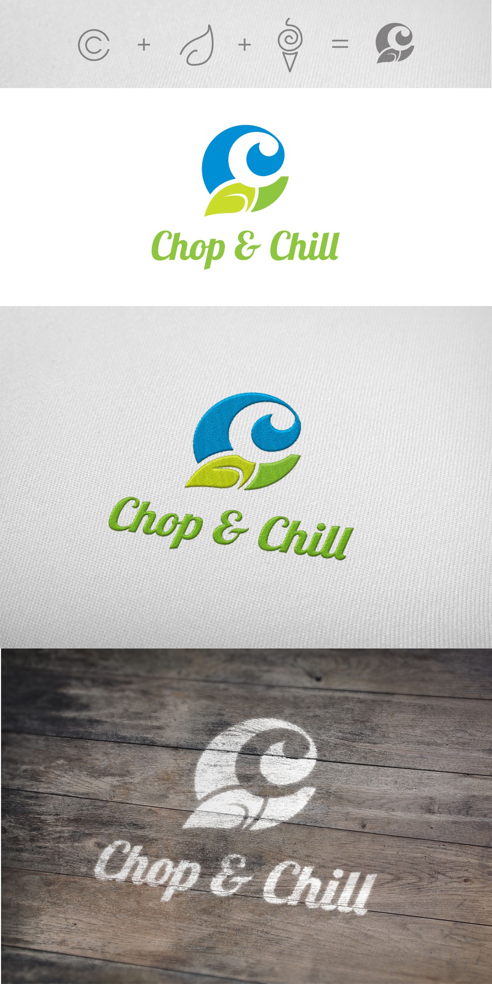
This logo was made for a full service store that served custom made chopped salads and offered self service frozen yogurt and ice cream.
They wanted a fun, fresh and creative design.
Thus, the short explanation for my logo design is the following:
Chop = fresh salads/vegetables --> green/leaf
Chill = ice cream/yogurt --> blue/creamy swirl
Chop & Chill graphic = a C within a C that each contain symbols which represent the above elements.