基本情報
ロゴに組み込む名称
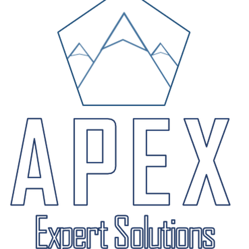
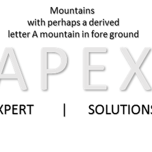
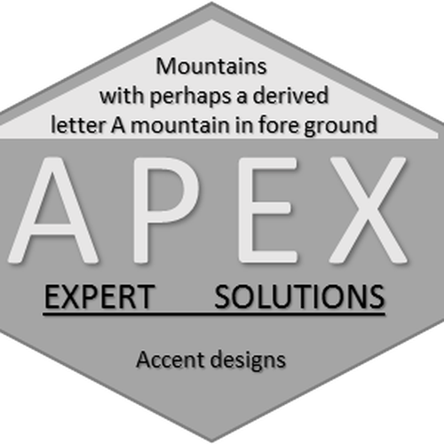
APEX Expert Solutions
ロゴに表記するキャッチフレーズ・スローガン
企業・商品について説明してください(業務・サービス内容、商品機能、顧客層・ターゲット層など)
Our team provides services, supporting analytic and engineering in our customers spaces. We also provide educational services in a number of different modalities. APEX Develops software for organizations requiring on premises big data analysis capabilities.
業種
安全性


参考資料

その他の要望・留意点
**20171114 UPDATE** Everything is looking good so far, maybe focus on some logos where the A has a mountain like influence. Haven't really seen as much of this so far. I just wanted to throw that out to the group. Again, thanks for everything that we have seen so far!!
**20171113 UPDATE** I haven't seen much in terms of geometric tessellation.... perhaps a few hexagons and or triangles coming together, with the overlapping portions creating an elegant and clean negative space letter A. Sorry if I didn't mention this as a possible logo type, but my lack of design vernacular is hindering me at the mo. Please let me know if you have any questions.
Our company provides Technology and analysis solutions within the national security sectors. It is important to us , that our logo design doesn't align solely with technology, training, analysis, nor security if that makes any sense.
In addition, I have attached two logos we are currently using. The APEX logo is what we are looking to replace. The logo that says ATLAS is something that we are utilizing for one of our engineering products. In my opinion it is more in line with what we would like to go with in terms of the font we would like to incorporate a logo. The simple geometries utilized are clean, but more product specific. Perhaps the logo could look more like an A derived from several geometries forming a mountain type of letter A, without getting too carried away, not necessarily similar to our ATLAS logo. Please let me know if you have any questions. I am a fan of triangles, hexagons, negative space, among other things. Please do not hesitate to contact me if you have any questions.
納品ファイル
ロゴ
最終デザインファイル
ライセンスが必要なフォントを使用している場合、コンペ主催者から承諾を得る必要があります。ライセンス上の理由により、クライアントへはフォントのファイルを提供せず、購入方法を伝えましょう。
ロゴに使われるテキストはアウトライン化してください。
I like the simple fonts utilized here, and how they pieced together to form the basic shape of the passenger pigeon.