会社情報
業種
食品・飲料品
会社名
Heritage Food Crafters
すでにお持ちのホームページ
heritagecraftchocolate.com, homesteadheritage.com
商品
商品名
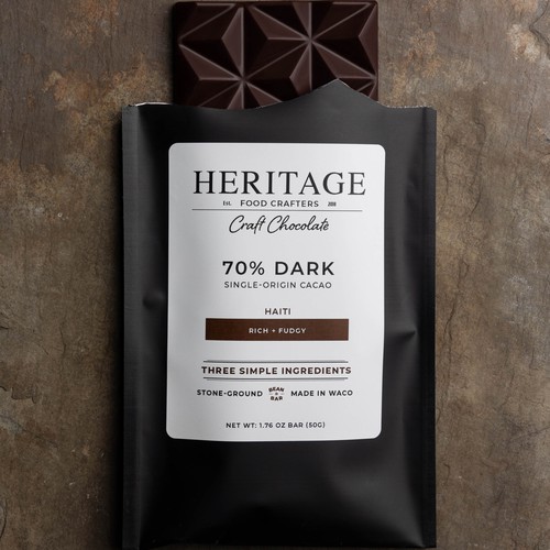
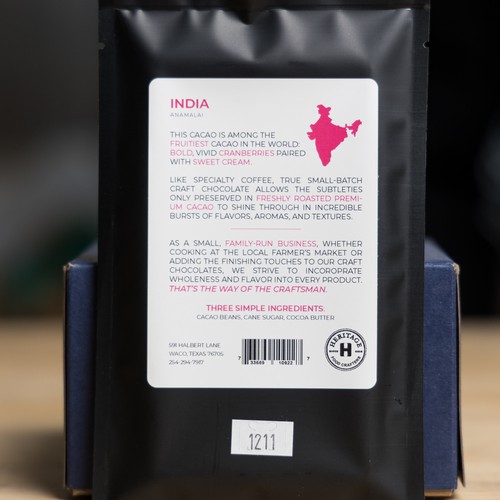
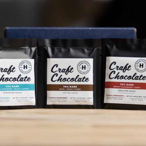
Heritage Craft Chocolate
商品の特徴
These are craft chocolate bars. We make everything from scratch, from bean-to-bar. We select premium cacao from farms around the world. Each chocolate bar contains the cacao from one of these places, making them single-origin chocolates. These origins are what we are highlighting as the "flavor".
この商品のターゲット層を説明してください
Over 80% of chocolate buyers are women, however we would like to target adults of any gender without having the packaging necessarily appear feminine.
デザインスタイル
スタイル
デザインニーズ
These chocolate bars retail between $9-$12, so this needs to be reflected on the packaging. What we have in mind is a chocolate bar that goes beyond mere chocolate. We want it to speak wholeness, community, unity, heritage, endless, craftsmanship, high-end, care, exodus. Our story will be linked somewhere here, that feeling of order and service needs to be captured on a level. We want the package to speak to the customer that what they are participating in can change their destiny. That the can be a part of something bigger than themselves.
We would like the package to include "single-origin" "bean-to-bar" "Made in Waco" (also possibly the largest and most important would be to emphasize the different "flavors" in the origin, i.e. Peru, Uganda, Vietnam, etc.
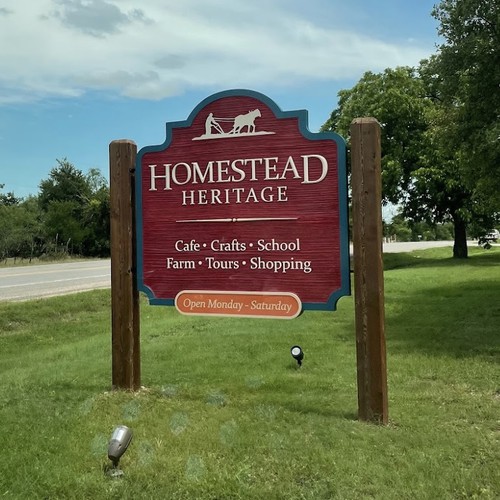
We are part of an agrarian, Christian community Homestead Heritage. We want the feeling of the larger community to shine through the packaging. Try to get a good feel for who we are, what we do, believe and our vision to get a sense of the heritage we are trying to portray. We have a short video that conveys our vision here: https://www.homesteadheritage.com/v…community/
The bar will have the country of origin featured, possibly a shape of the country on the back in some way with nutritional information, contact info, our mission, etc.
We like the hand-sketched feel but we are open to suggestions. The package will be in a mylar pouch similar to our current black package but it will be narrower and printed directly on it. We would like it to have a metallic paint on some or most of the packaging to reflect a premium, yet hand-crafted feel.
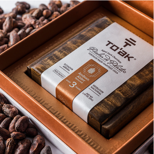
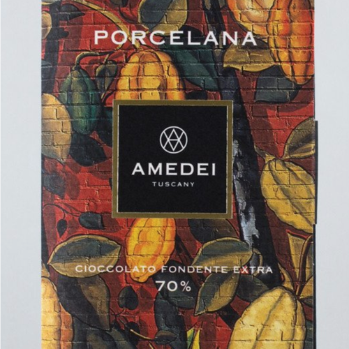
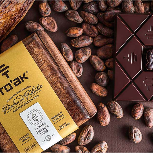
Companies we like: https://toakchocolate.com/
https://dicktaylorchocolate.com/
https://manoachocolate.com/
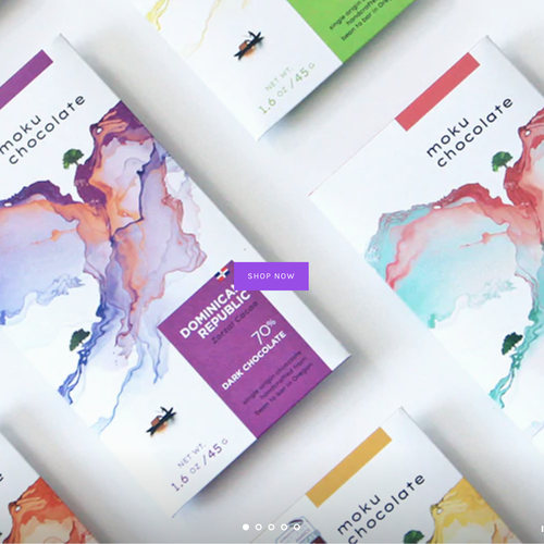
https://mokuchocolate.com/
We are currently forming communities and relationships around the world that have farms growing the cacao which will enable us to be more than just bean-to-bar, encompassing a wholistic experience by tending and husbanding these communities and the soil expanding the reach of our own business, community and life; a global community of life. We want the audience to feel that they are helping bring this to more of a connected reality through their purchase.
Our slogans we might want to work with: "its the way of the craftsman" and "get back to your roots"
We are wanting to have packaging that can be used for three different lines: single-origin will be designed this time and we have inclusions and sugar-free in mind for future development.
We like the idea of having one design for all of the bars in one line but that has certain elements that differentiate the flavor, origin, inclusion, etc.
In terms of color we have included a picture of our Heritage Food Crafters tent at the farmer's market. Here are the RGB swatches for the gold and brown: dca85a, 301d19
避けて欲しいこと
サイズ
パッケージの寸法・サイズ
納品ファイル
1 x 商品パッケージ
最終デザインファイル
ライセンスが必要なフォントを使用している場合、コンペ主催者から承諾を得る必要があります。ライセンス上の理由により、クライアントへはフォントのファイルを提供せず、購入方法を伝えましょう。